Making sense of the world
As humans, we understand the world around us using similar tools. The first thing we do is to retrieve as much data as we can. We have so many ways of collecting data: we can use our eyes to see the light reflected from objects around us or use our ears to hear the upcoming soundwaves. We can even choose more intrusive methods if we think that’s a good idea, like touching, smelling, or tasting. But we use the last three mostly based on the observations we make with the first two, as it is evolutionarily disadvantageous and might be pretty deadly to touch a poisonous mushroom, lick a random caterpillar or smell a grizzly bear.
After collecting the data, we use our brains to make sense of it. Have I seen something like this before? Is it possibly dangerous? Is it edible? We are much like computers in a sense: our somatosensory systems are like the I/O’s (data in, data out) and our brain is our CPU, RAM, ROM, and hard disk. After that comes the action part, if it’s dangerous, run away as fast as you can (or play dead maybe?) or if it’s a mushroom you think you can eat, pick it up. The action part requires a whole other system that we call the musculoskeletal system.
We are creatures that are composed of many systems that work together. But not all of us have all the systems working in full capacity- we simply might not be born with it, or permanently or temporarily lose it along the way. That means although we experience the world in similar ways, each of us experiences something different. As a byproduct of living as a society, we also share tools and common spaces. Therefore, people who create anything for humans to use should have these questions in their mind: who am I creating this for? and can everybody in that group use it? As an alternative, we can create other versions of the same thing that is more friendly to people that lack some ability. But as this option is not always available, we should create things keeping all the humans in mind as much as possible.
The web is a place that we all share as well, so creating an environment where everybody can understand and navigate is important. In the web context, this is called accessibility, which can be very simply defined as designing websites and software everyone can use easily. This article briefly explores some stuff that we can keep in our minds when creating websites, and for information that has more depth to it, visit the links I provided in the resources section.
Accessibility in Web Development
In this section, we will explore what we can do to provide a better accessibility experience in our web applications.
Keyboard only design
Users with motor impairments cannot always use a mouse or a touchpad, so we need to make sure that the website we design is fully functional with only keyboard usage. There are keyboard shortcuts that provide various functionalities, and you can and should be able to control a computer or browse websites by using the keyboard only. Standard HTML (when used properly) is designed to be fully keyboard-ready when it is rendered by a browser, but there are some parameters you can check before you give it a go:
- Are all relevant elements of the webpage is focusable? (Links, buttons, and other navigational elements should be focusable to be navigated through and interacted with. Buttons and links that have the
hrefattribute are inherently focusable. Adding thetabindex="0"attribute to an HTML element makes it focusable, but not interactable.) - Can all the events be triggered by keyboard users and by different devices? (Example:
hoverevent can be triggered on desktop but not on mobile devices, and are not set off by keyboards, so dropdowns that open up on hover are not exactly accessibility friendly. On the other hand, theonClickevent can be triggered by different devices and can be fired upon pressing theEnterkey.) - Do you have any device-specific functionality, and if you do, are they on purpose? Everything that can be done with a touchpad or a mouse should also be done with a keyboard, but if you’re adding an event that can only be triggered by a keyboard key, then you’re limiting the usage with a mouse or a touchpad, and that is also a no-go. Listening to an event that is only going to be fired when a certain keyboard key is pressed can cause some problems because there might be another person that is trying to navigate the website using a mouse.
- Can the functionalities be used by mobile and desktop keyboards at the same time? The keyboards of different devices might not entail all the keys possible, so be careful not to assign any functionalities to the keys that are not common, or provide an alternative way to use them.
- If they exist, are the elements in dialog boxes correctly focused? Check out this beautiful guide to understand it better.
There’s a great variety of disabilities, but one we can do a lot about is visual impairments. There are software applications that are called screen readers, which help display the text and images of a website in a non-visual way, like text-to-speech, sound icons, or a Braille device. There are voice assistants like Alexa or Google Home that can also interact with websites.
The tools that help a person with any disability to complete a task are called assistive technologies (AT). As web developers, we can write code that is compatible with these technologies to create a better experience for the people who are using it.
Semantics
The markup language that we use to create websites (otherwise known as the HyperText Markup Language, or the short version - HTML) is equipped with accessibility-friendly features. Some tags include no information about the content they hold, such as <div> and <span> tags. These are simple containers that you can style in whatever way you want, but there is a downside of using these: assistive technologies like screen readers cannot understand the context of the content a given div element holds. Screen readers cannot convey the custom styling an element has, so font-size, font-weight, text-shadow, and color you assign to a tag with no semantics has no impact whatsoever on the experience of a person that’s using them. Therefore, using them abundantly can impact users with accessibility issues negatively. Imagine, if you had no styling for headers, the text, and everything that’s on a webpage, you would have a hard time understanding the information. For this reason, there are semantic tags, which provide information about the content inside. We can group elements with certain tags, like the <main> tag, which by definition encloses the main content of the page, or the <header> and <footer> tags, which holds the header and footer elements, respectively. According to MDN, there are around 100 semantic tags that we can use, and it can also help with search engine optimization which will increase the visibility of our website (yay, additional benefit!).
Also, although the web browsers are pretty forgiving, writing code by using the correct syntax is important for accessibility as well. For example, if the closing tags are not provided, screen readers might not be able to do their magic even if the browser renders the code correctly on the screen. There are tools for us to check if our website fits the web and accessibility standards like TotalValidator. Check out this article if you are eager to use it.
ARIA
Modern websites use a lot of dynamic content that cannot always be defined by semantic HTML tags. To add custom semantics to HTML contents, the Accessible Rich Internet Application (ARIA) specification was introduced by the Web Accessibility Initiative (WAI). This provides two specific attributes that can be added to HTML elements: role and aria-*.
The role attributes are used to override the semantic meaning of an element (for the screen readers as well):
// This span is now semantically declared as a button:
<span role="button">
The aria-\* attributes are used to provide status, depending on the role. For example, if an element has the role of “button”, it can have two kinds of aria attributes, one being aria-pressed and the other one being aria-expanded. These aria attributes can have specific values, for example, aria-pressed can have the values true, false, mixed, and undefined.
// Our span with the button role now has a status that indicates it has been pressed:
<span role="button" aria-pressed="true">
Color and contrast
I think this one is the most intuitive, as our human eyes can easily pick up things that are in high contrast as oppose to their environment and fail to do so when there’s low contrast. So if you want your website to be perceived easily, you should provide contrasting elements. But you shouldn’t trust your eyes and use objective tools when you’re deciding if there’s enough contrast or not. Let’s see how you can do that, and what the contrast word entails.
Contrast is calculated by using a value called relative luminance. Relative luminance is the brightness level of any point in a colorspace that is shown between 0 and 1, with 0 being the darkest and 1 being the lightest value possible. So any two pixels on your screen have a relative luminance value, and we can calculate the contrast between them using these values. The formula looks like this:
Ll: Luminance value of the lighter value
Ld: Luminance value of the darker value
(Ll + 0.05) / (Ld + 0.05)
The result of this formula ranges between 1:1, which means there is no contrast whatsoever, and 21:1, which is the highest contrast level there is. Acceptable levels of contrast depends on the size, weight, and even the type of font that is being used. The Web Content Accessibility Guidelines (WCAG) specify a minimal contrast ratio of 3:1 for large texts and 4.5:1 for texts in general.
One thing to keep in mind is that the tone (the color) is not a determining factor in this contrast ratio, meaning it shouldn’t matter if you cannot see any colors at all, you still need to be able to distinguish items through contrast differences. But to make it even more clear, you can use different shapes and additional features like underlines, borders, etc. to make things even more clear. There are many tools you can use to check the contrast levels on a website, such as this Chrome extension.
What else can we do?
Although I mainly focused on motor and visual impairments, the disabilities are not limited to these.
For people with hearing impairments, we can make sure the main functionality of our website should not depend on sound and provide some sort of alternative such as transcripts. (One of the best examples I’ve seen is Coursera’s website, which has the video and a full transcript underneath it.)
We can provide some help with some of the cognitive impairments as well. For attention deficit disorders, we can provide a zoomable site, which will help the user focus on a single area if needed. Also, minimal design can help these users focus better.
The websites also should provide a warning beforehand if the content includes flickering lights and motions that can cause epileptic seizures and migraines.
The End
Products that are not carefully thought of can be infuriating, even if you don’t have an accessibility issue. For example, check out this mug:

I have a very similar mug that cuts my fingers each time I try to clean it, but I like my eyes the way they are so it serves as a pencil holder now.
Image Credit: https://cheezburger.com/8206597/17-terrible-product-designs-that-will-have-you-asking-why
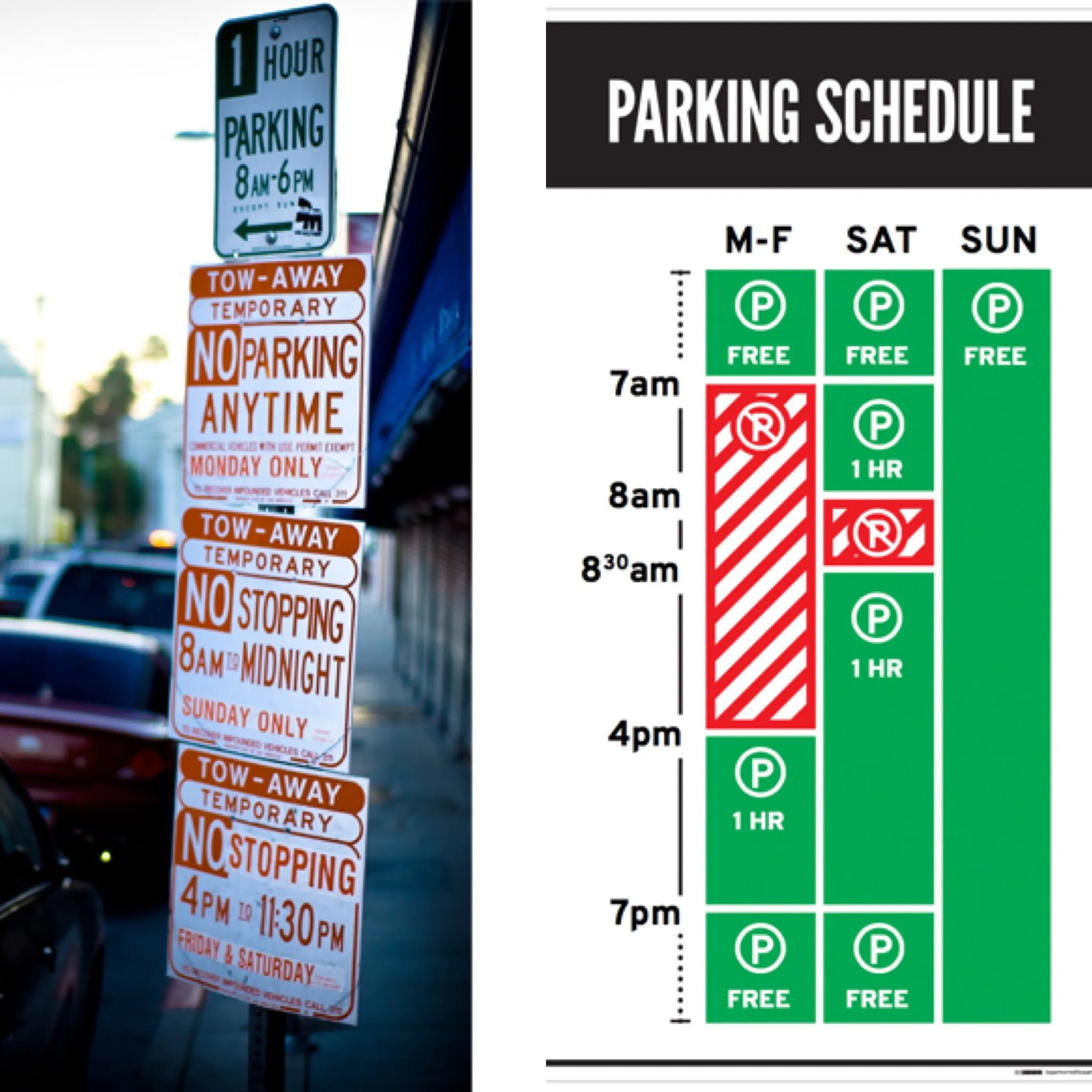
Or check out this sign pollution that takes at least several minutes to decipher, even on a good day:

Image Credit: https://twitter.com/NxtLvlBranding/status/839682762823041024/photo/1 by Michelle McCoy
So accessibility is not only a web issue, but a daily one, and one that we tend to miss. If you’re interested for more, check out The Design of Everyday Things by Donald A. Norman, I am sure that you’ll find it interesting.
Resources
- Wikipedia - Screen reader
- Web Content Accessibility Guidelines (WCAG) 2.1
- MDN - Accessibility, Semantics
- Accessibility Developer Guide
- Google Web Fundamentals - Accesibility by Meggin Kearney, Dave Gash, Alice Boxhall, Rob Dodson

